Several times, senior management have asked Team Wireless to provide an uptime figure for eduroam. While we do have an awful lot of monitoring of systems and services, it has never been possible to give a single uptime figure because it needs some detailed knowledge to make sense of the many Nagios checks (currently 2704 of them).
From the point of view of a Bristol user on campus here, there are three services that must be up for eduroam to work: RADIUS authentication, DNS, and DHCP. For the purposes of resilience, the RADIUS service for eduroam is provided by 3 servers, DNS by 2 servers and DHCP by 2 servers. It’s hard to see the overall state of the eduroam service from a glance at which systems and services are currently up in Nagios.
Nagios gives us detailed performance monitoring and graphing for each system and service but has no built-in aggregation tools. I decided to use an addon called Business Process Intelligence (BPI) to do the aggregation. We built this as an RPM for easy deployment, and configured it with Puppet.
- nagiosbpi.spec – to build your own RPM from the source
BPI lets you define meta-services which consist of other services that are currently in Nagios. I defined a BPI service called RADIUS which contains all three RADIUS servers. Any one RADIUS server must be up for the RADIUS group to be up. I did likewise for DNS and DHCP.
BPI also lets meta-services depend on other groups. To consider eduroam to be up, you need the RADIUS group and the DNS group and the DHCP group to be up. It’s probably easier to see what’s going on with a screenshot of the BPI control panel:
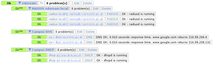
BPI control panel
So far, these BPI meta-services are only visible in the BPI control panel and not in the Nagios interface itself. The BPI project does, however, provide a Nagios plugin check_bpi which allows Nagios to monitor the state of BPI meta-services. As part of that, it will draw you a table of availability data.
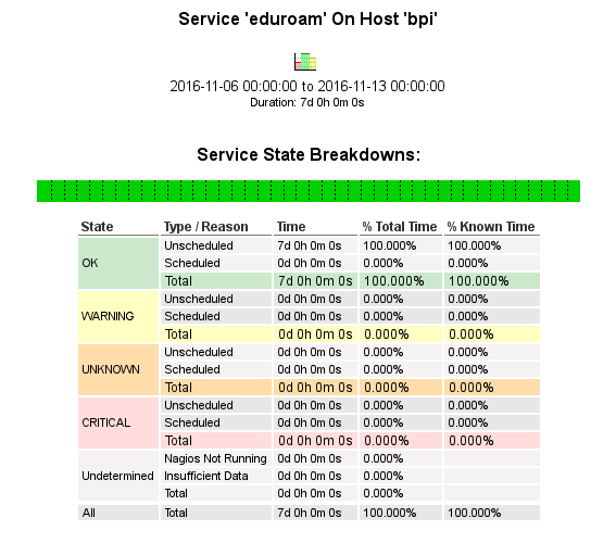
eduroam uptime
So now we have a definitive uptime figure to the overall eduroam service. How many nines? An infinite number of them! 😉 (Also, I like the fact that “OK” is split into scheduled and unscheduled uptime…)
This availability report is still only visible to Nagios users though. It’s a few clicks deep in the web interface and provides a lot more information than is actually needed. We need a simpler way of obtaining this information.
So I wrote a script called nagios-report which runs on the same host as Nagios and generates custom availability reports with various options for output formatting. As an example:
$ sudo /usr/bin/nagios-report -h bpi -s eduroam -o uptime -v -d
Total uptime percentage for service eduroam during period lastmonth was 100.000%
This can now be run as a cron job to automagically email availability reports to people. The one we were asked to provide is monthly, so this is our crontab entry to generate it on the first day of each month:
# Puppet Name: eduroam-availability
45 6 1 * * nagios-report -h bpi -s eduroam -t lastmonth -o uptime -v -d
It’s great that our work on resilience has paid off. Just last week (during the time covered by the eduroam uptime table) we experienced a temporary loss of about a third of our VMs, and yet users did not see a single second of downtime. That’s what we’re aiming for.